
Grüns Re-design
This redesign intentionally targets three high-impact sections of the website that strongly influence user understanding, confidence, and conversion.
Time One Week
Role Product Desinger
Team Team of 1

Overview:
Grüns is a premium gummy supplement brand focused on everyday nutrition. While the product quality is strong, the existing website experience created friction that made it harder for users to confidently choose and purchase.
This project reimagines the Grüns website as a calm, clarity-driven shopping experience that supports confident decision-making without aggressive persuasion.
Grüns — Website Redesign
A focused UX redesign exploring how reducing cognitive load and decision pressure can transform a supplement shopping experience from overwhelming to confident.
Responsibilities
Product strategy, user research, UX design, interaction design, prototyping, and usability testing.
The Objective
The main redesign of Grüns website experience in order to reduce overwhelm, clarify choices, and build user confidence during the supplement purchasing process.
The Outcome
A redesigned website prototype that simplifies entry, streamlines decision-making, and improves product comparison clarity—validated through usability testing and design critique.
Problem
How Might We Reduce Overwhelm in Supplement Shopping?
Grüns offers high-quality gummy supplements, but the website experience introduced unnecessary friction through:
Aggressive promotional messaging early in the experience
Too many simultaneous choices competing for attention
Comparison layouts that increased confusion rather than clarity
These factors increased cognitive load and decision pressure, making it harder for users to feel confident about what to buy—even when they were already interested in the product
GOAL
Design a Calm, Confidence-Driven Shopping Experience
Design a focused, supportive website experience that:
Reduces cognitive load at entry
Guides users through decisions progressively
Clarifies product differences without overwhelming comparison
The redesign prioritizes clarity over persuasion, allowing trust and confidence to emerge naturally through thoughtful UX.
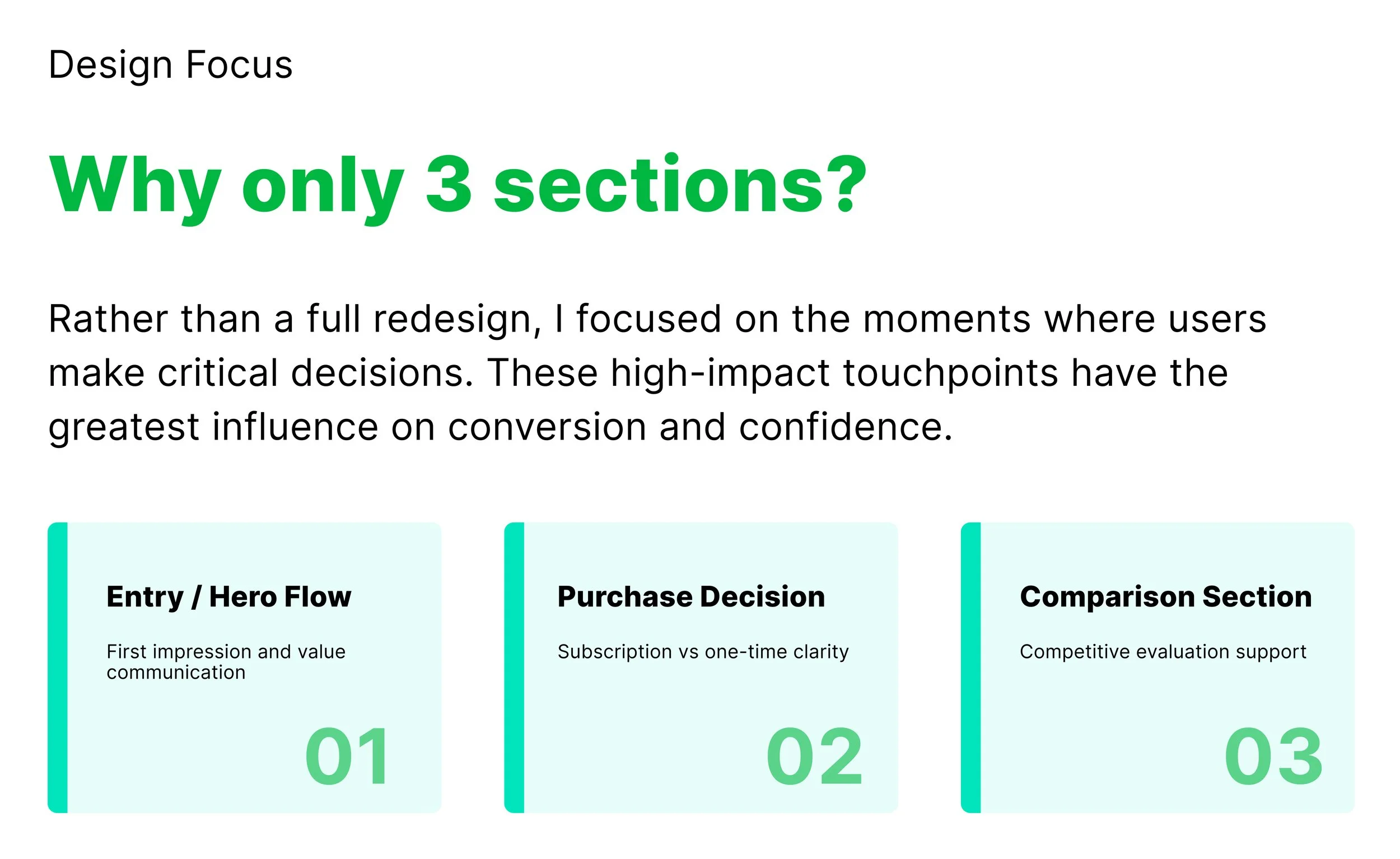
01 ENTRY EXPERIENCE
From Promotional Overload to Calm Orientation
Previously, consumers were bombarded with strong commercial messaging, many competing CTAs, and thick information upon access. This induced a sense of urgency before comprehension, increasing cognitive burden and decreasing trust.
The redesign eliminates the first pressure and refocuses the entering experience on orientation rather than conversion. Users can grasp the product more calmly by simplifying information, minimizing conflicting actions, and developing a clear visual hierarchy.

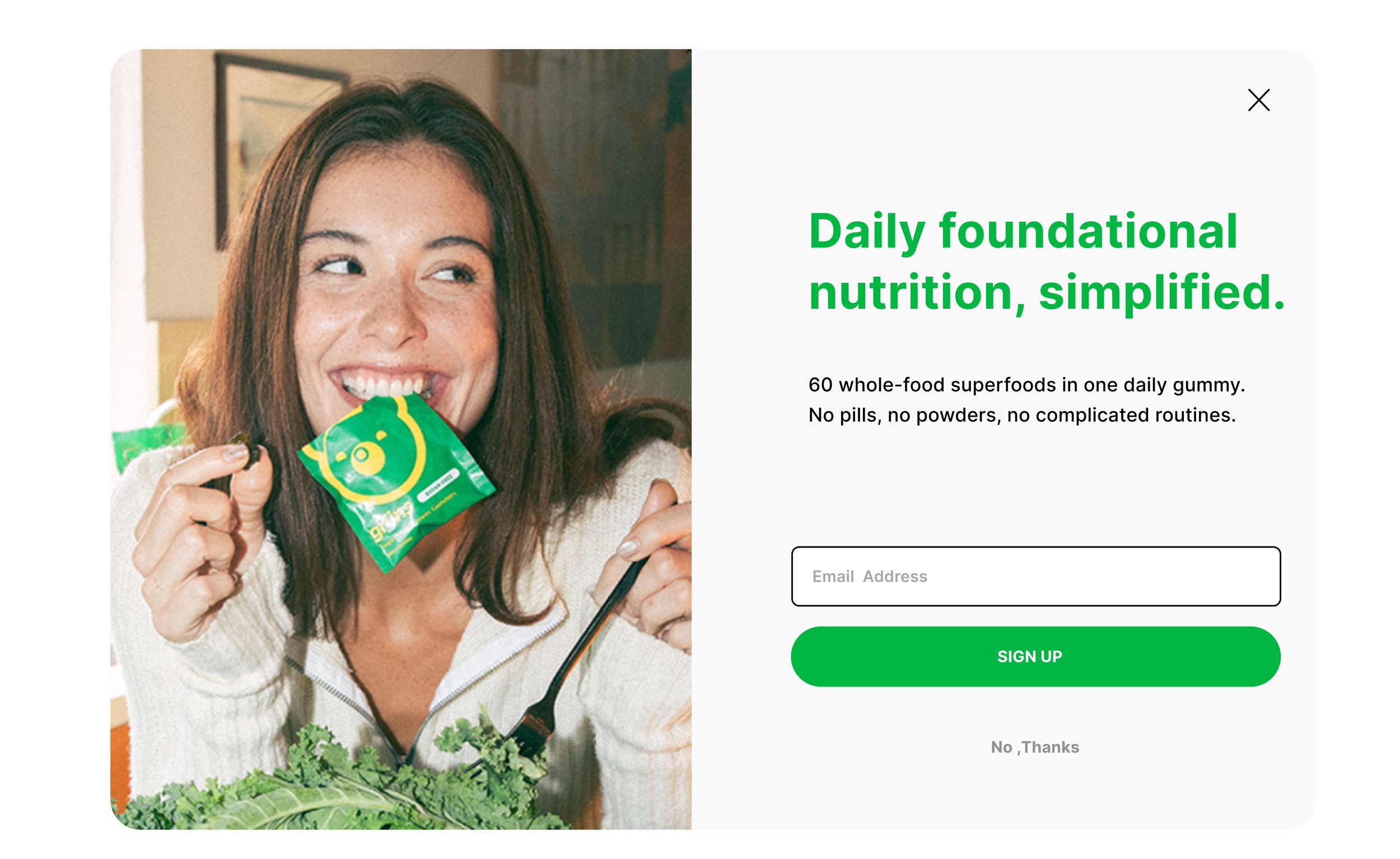
After - Value First Entry
Clear value proposition leads the page
Single, calm primary action
Promotions are optional and dismissible
Trust signals integrated naturally
Before- Discount First Entry
Clear value proposition leads the page
Single, calm primary action
Promotions are optional and dismissible
Trust signals integrated naturally
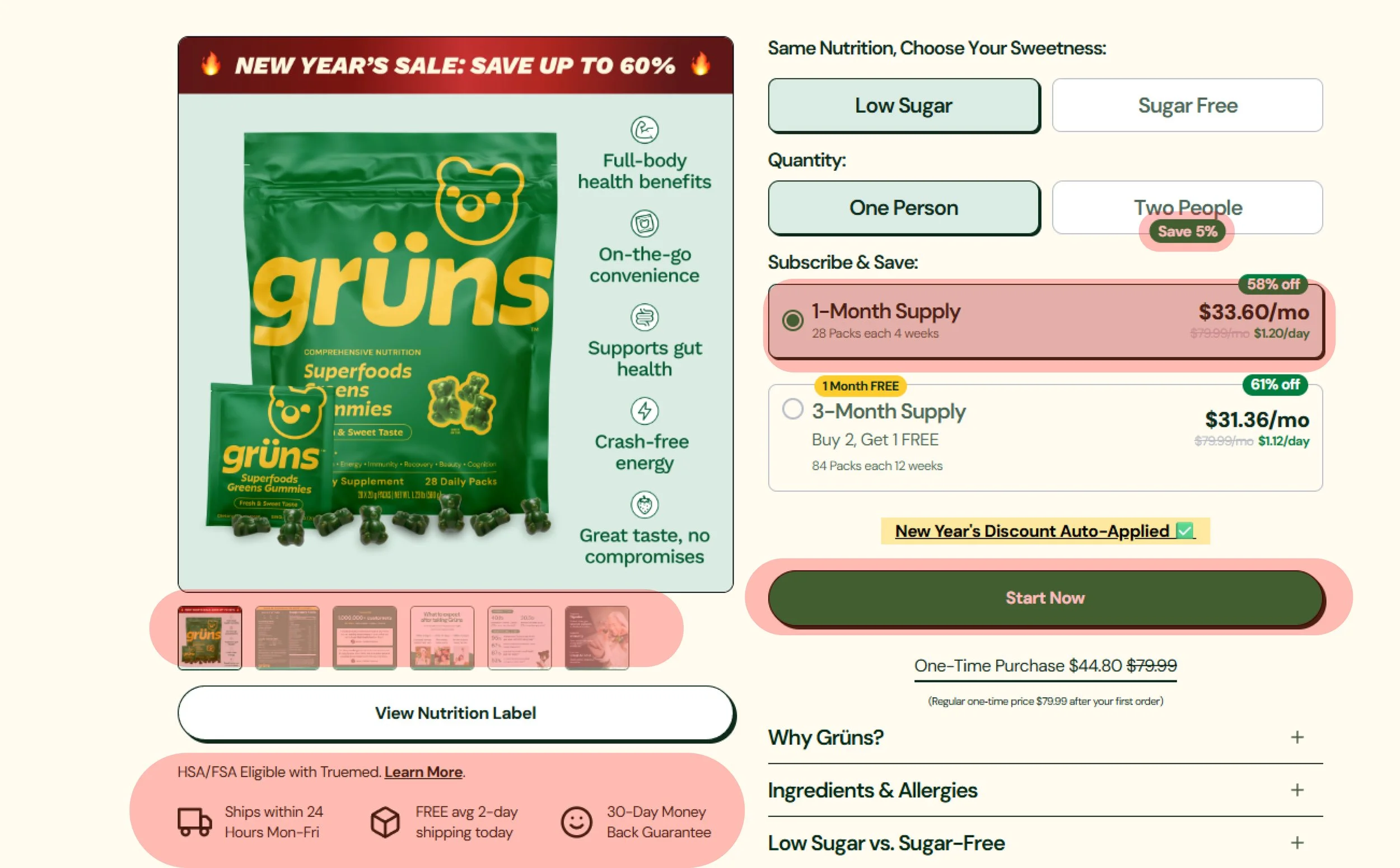
02 DECISION FLOW
Guiding Users From Introduction to Confident Selection
Previously, people were pushed into complicated purchasing decisions with little understanding. Product information, pricing, and subscription alternatives emerged before users could fully comprehend the product's worth, creating cognitive load and hesitancy.
The redesign includes a two-step decision flow: a calm product introduction page that promotes understanding, followed by a focused product page that aids selection. The experience eliminates pressure, clarifies intent, and allows users to advance with confidence by separating learning and choice.
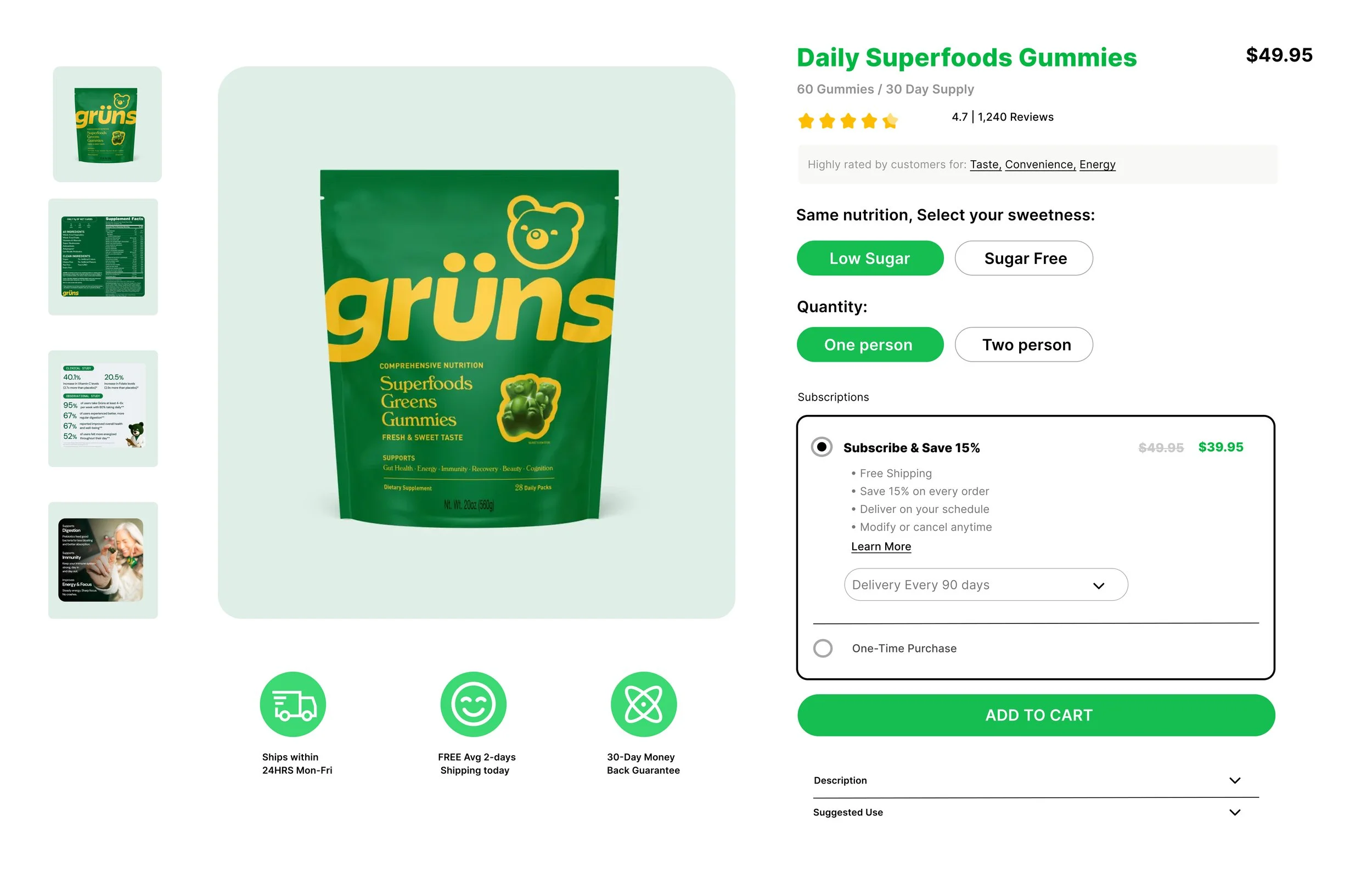
After - Dashboard Page
Clear primary purchase action
Friction-reduced conversion path
Modular option structure
Consistent decision system
Before- All Decisions at Once
Product type, quantity, subscription and the shown together
No clear hierarchy between options
Users must process everything to proceed
Decision fatigue leads to abandonment
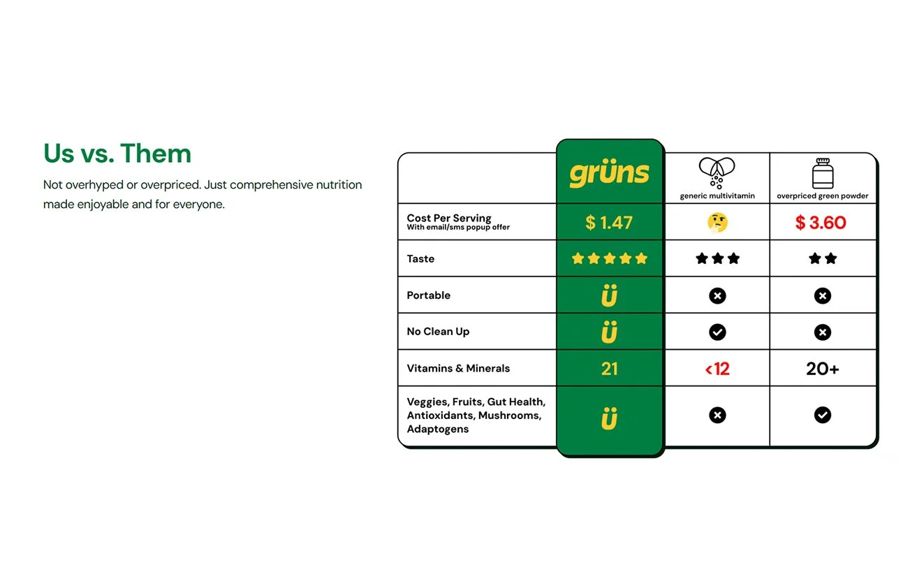
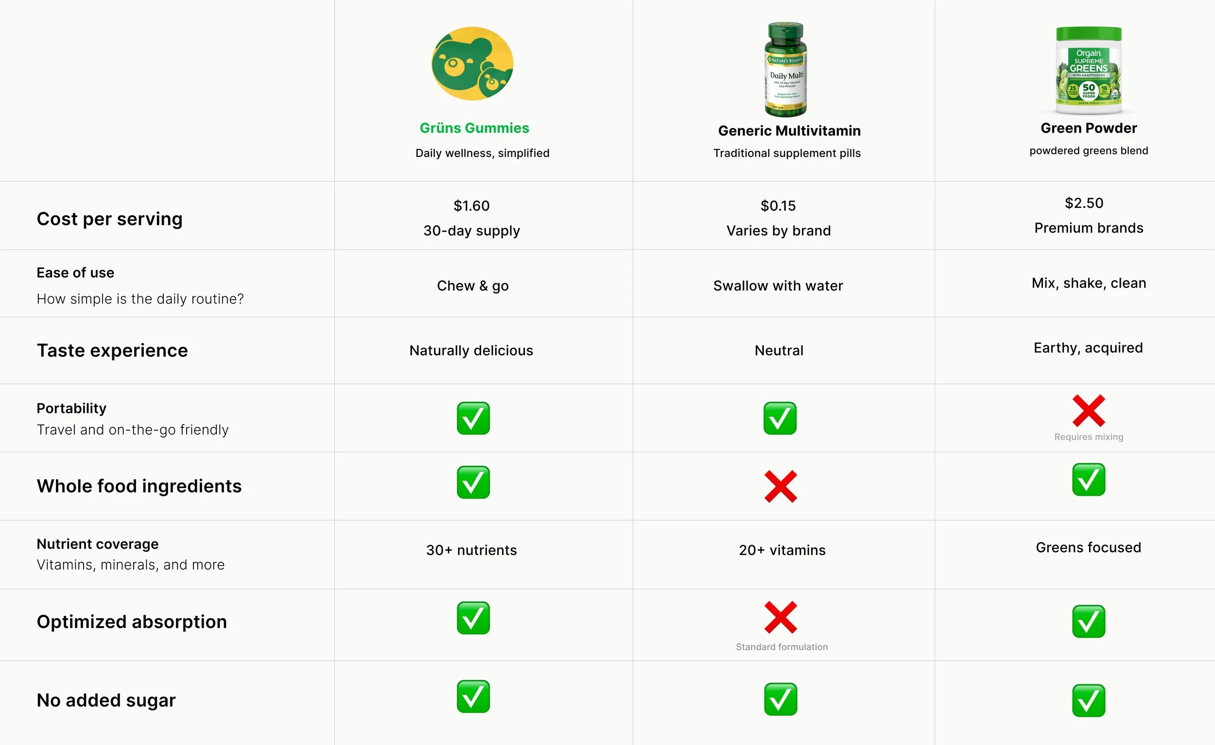
03 PRODUCT COMPARISON
Guiding Users Toward Meaningful Differences
Previously, users were asked to evaluate pills, powders, and multivitamins all at once, with inconsistent images and dense data. This made it impossible to scan, select, and comprehend what truly mattered.
The revised comparison experience streamlines evaluation by focusing on relevant qualities, adopting a uniform framework, and clearly displaying strengths across options—allowing consumers to rapidly comprehend differences and make confident decisions.
After - Product Introduction
Separate learning from purchase
Reduce early decision pressure
Progressive option disclosure
Clear hierarchy and grouping
Before- All Decisions at Once
Product type, quantity, subscription and the shown together
No clear hierarchy between options
Users must process everything to proceed
Decision fatigue leads to abandonment
What I learned...
Through this redesign, I learned that clarity is achieved not by adding features but by minimizing decision points. By eliminating friction and premature promotional elements, the user experience evolved into one that fosters calm and confidence-driven decision-making. The application of progressive disclosure effectively transformed complexity into clarity, delivering relevant information at appropriate moments. Ultimately, trust was established through restraint rather than urgency, as a clear information hierarchy emerged when distractions were removed, allowing essential elements to stand on their
What I’d Do Better Next Time
Next time, I will confirm assumptions earlier using lightweight user testing, as even casual comments can quickly expose blind spots. I would look into different entry messaging and recommendation patterns to better understand how different people perceive "calm confidence." I'd also start working on content strategy earlier to better align UX and copy from the beginning. Finally, I would favor mobile-first exploration, where cognitive load and decision fatigue are typically more severe.